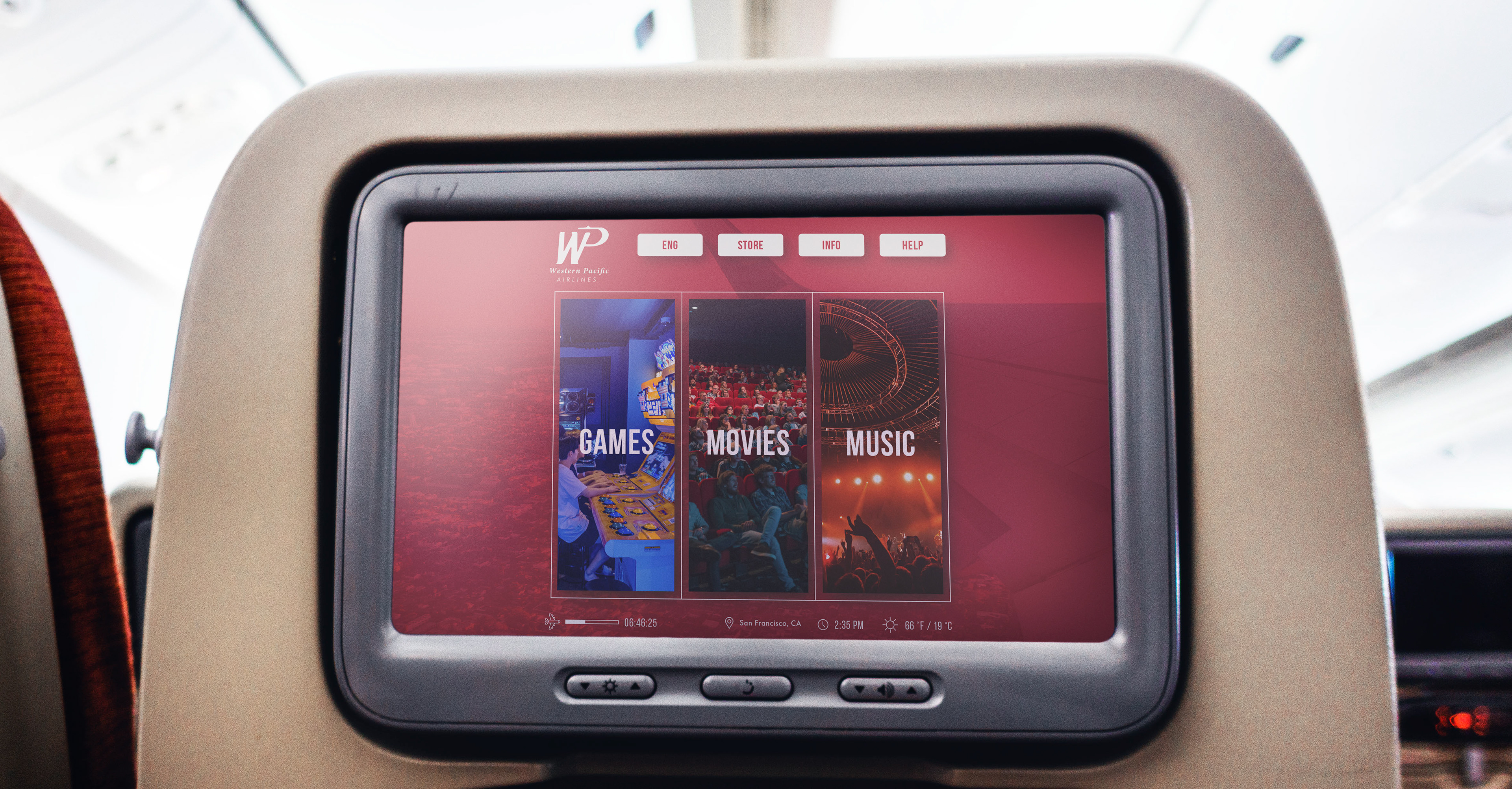

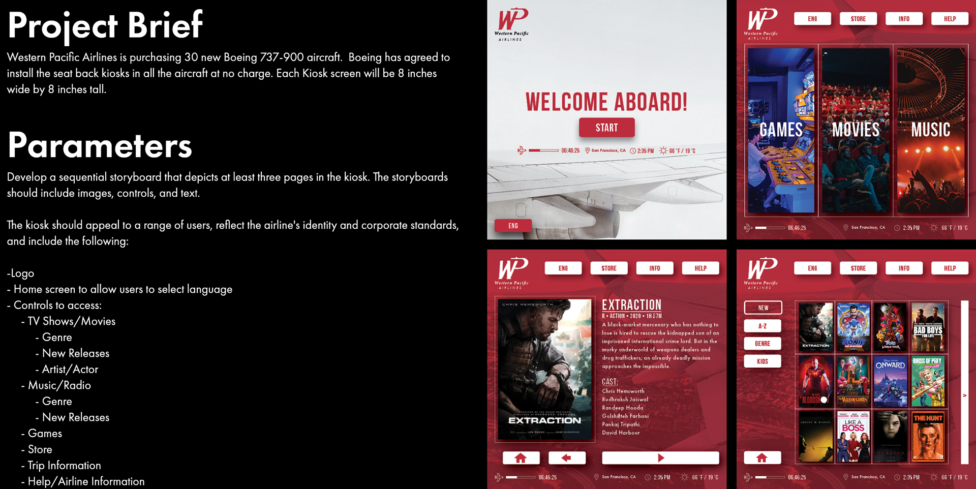
Problem
After doing preliminary online research, current airplane kiosks often have too many containers, buttons, and images along with small thin hard to read text. My goal was to design a layout that would consolidate all of the required elements while trying to maintain both a minimal and dynamic aesthetic.
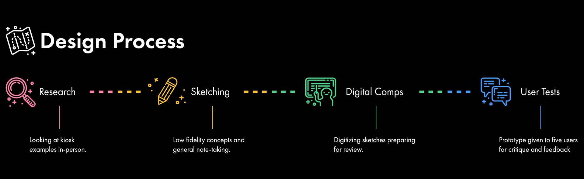
Research
Real Life Examples
By looking at kiosks in-person I felt that I would gain a better understanding being able to physically interact with them as opposed to doing strictly online research.
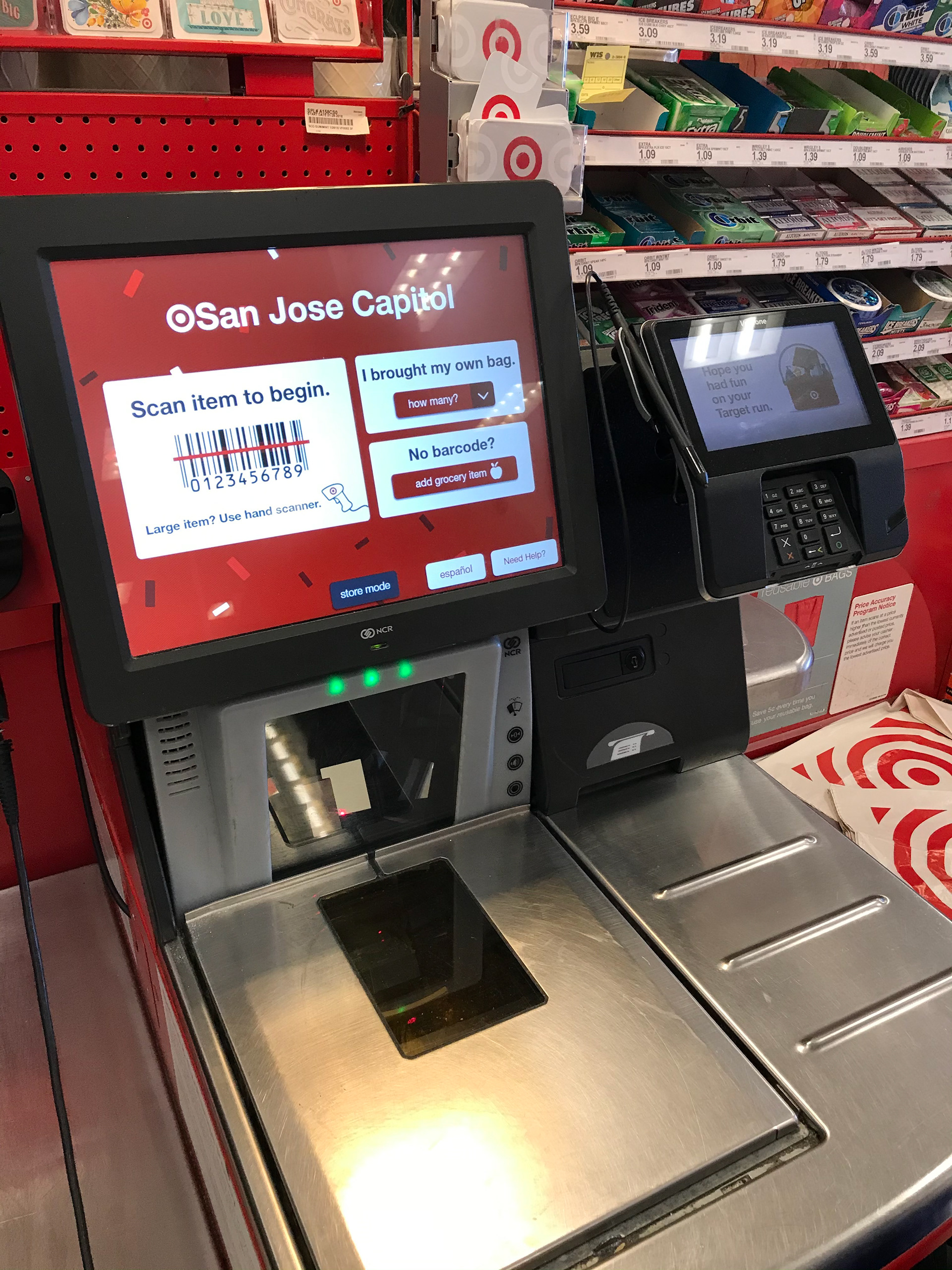
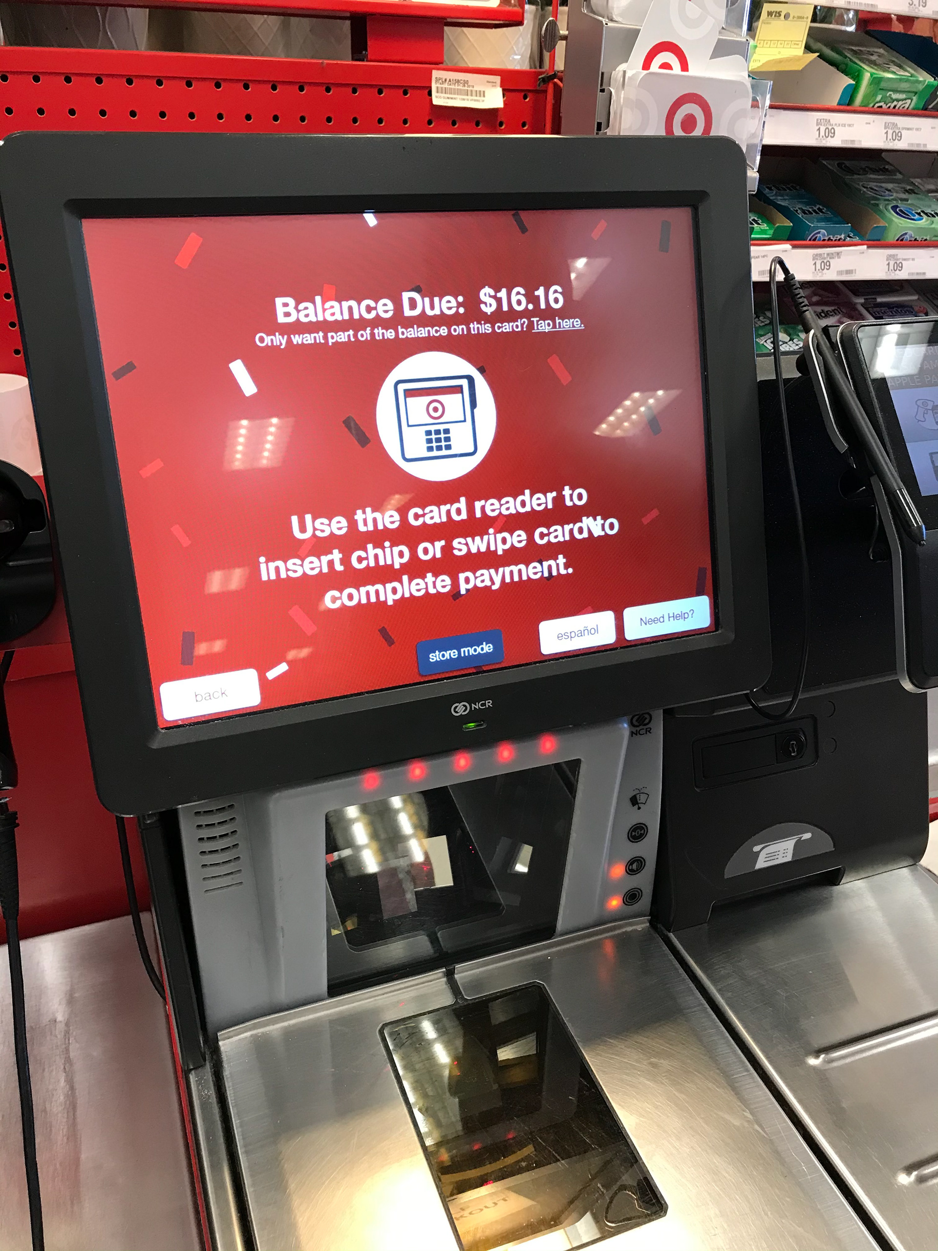
Observation #1
Simplicity
There were little options in the self-checkout, but in this instance I think that is necessary. Self-checkouts are usually for customers with little items or want to check out their items faster and you don't want to overcrowd the UI with too many options. This might increase the chances of customers getting confused or overwhelmed.
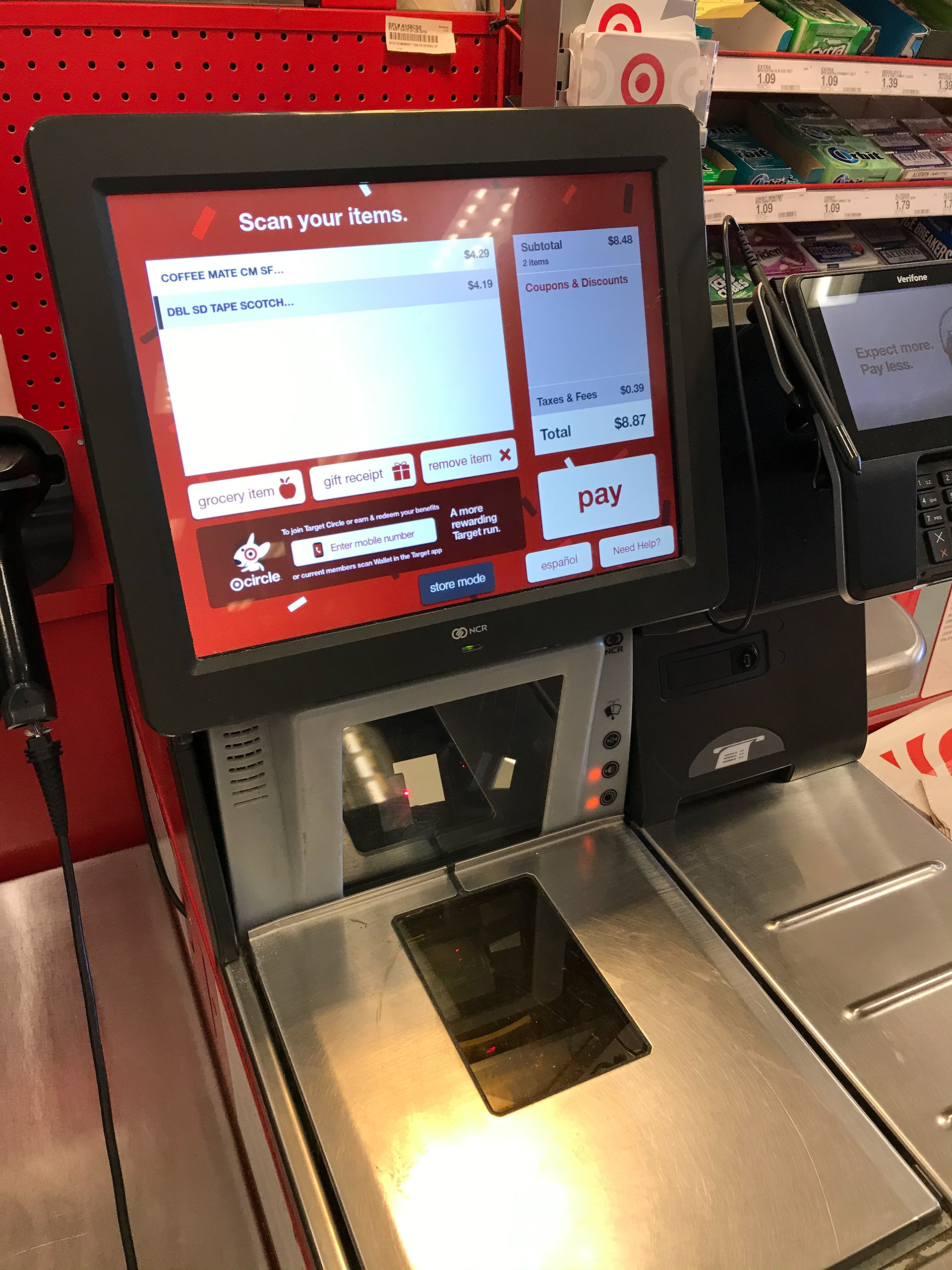
Observation #2
Big Elements
I noticed how big the cards and buttons were. The large size made it very easy to see what was on them and are more friendly to people with larger fingers.
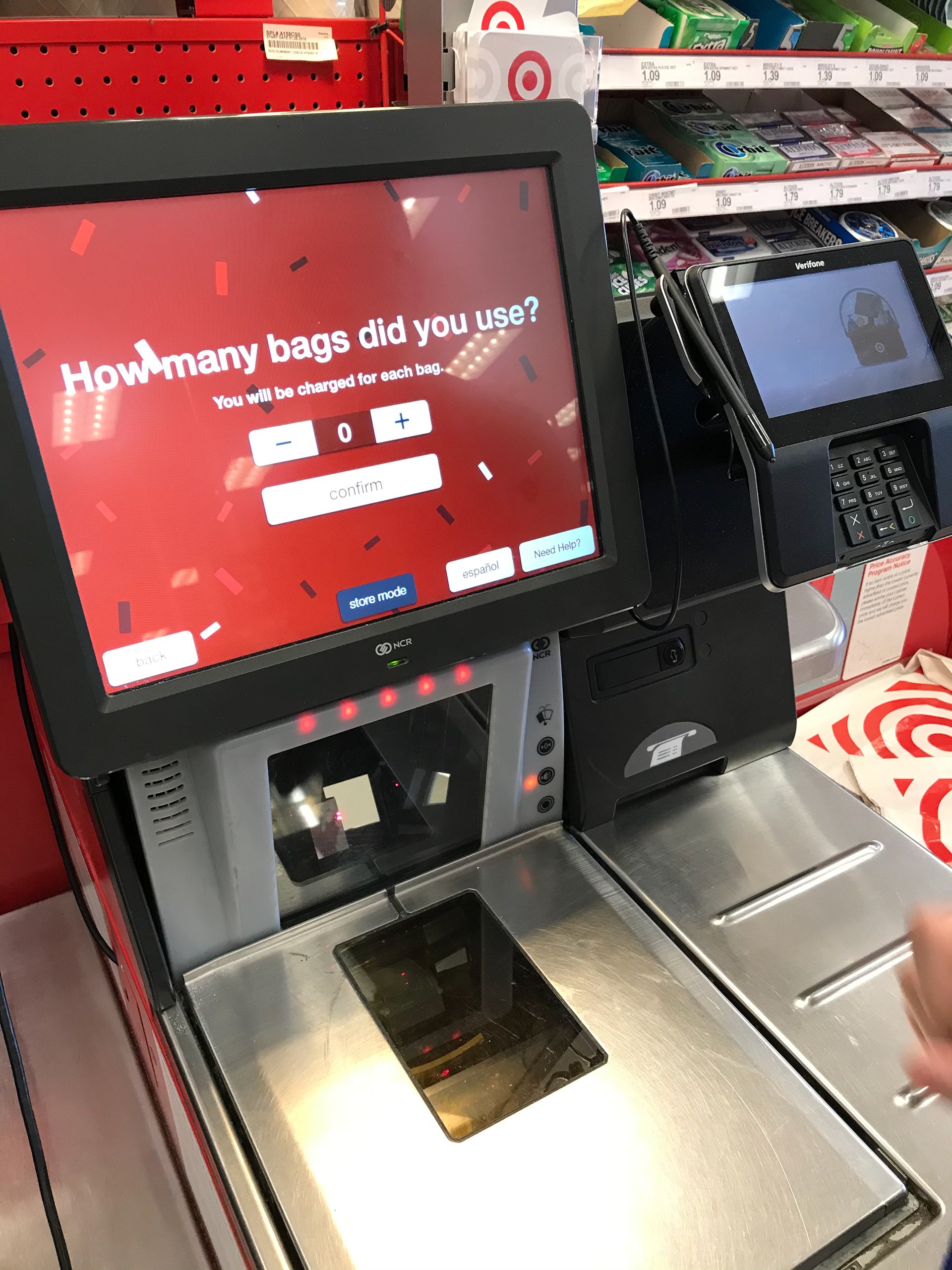
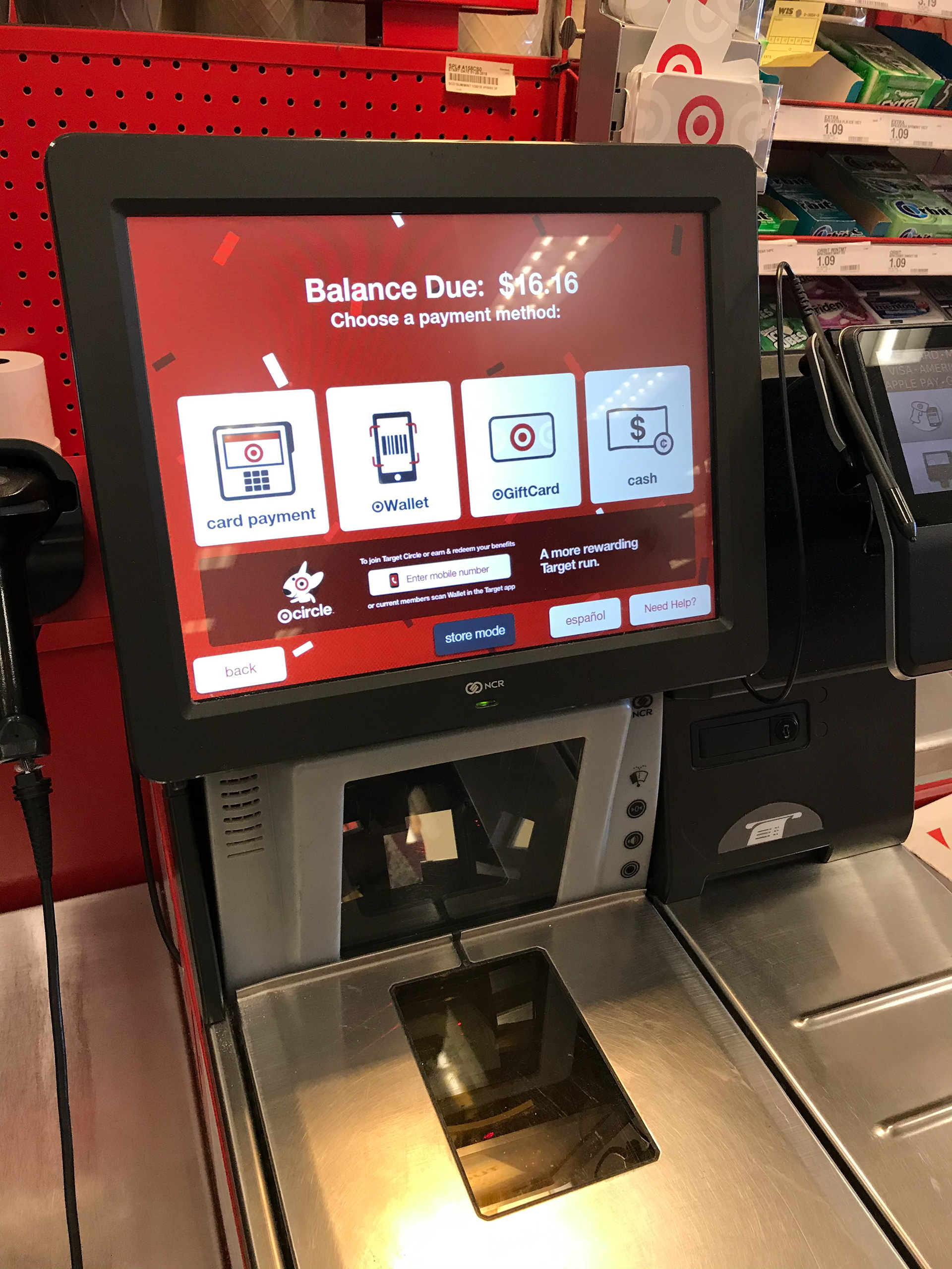
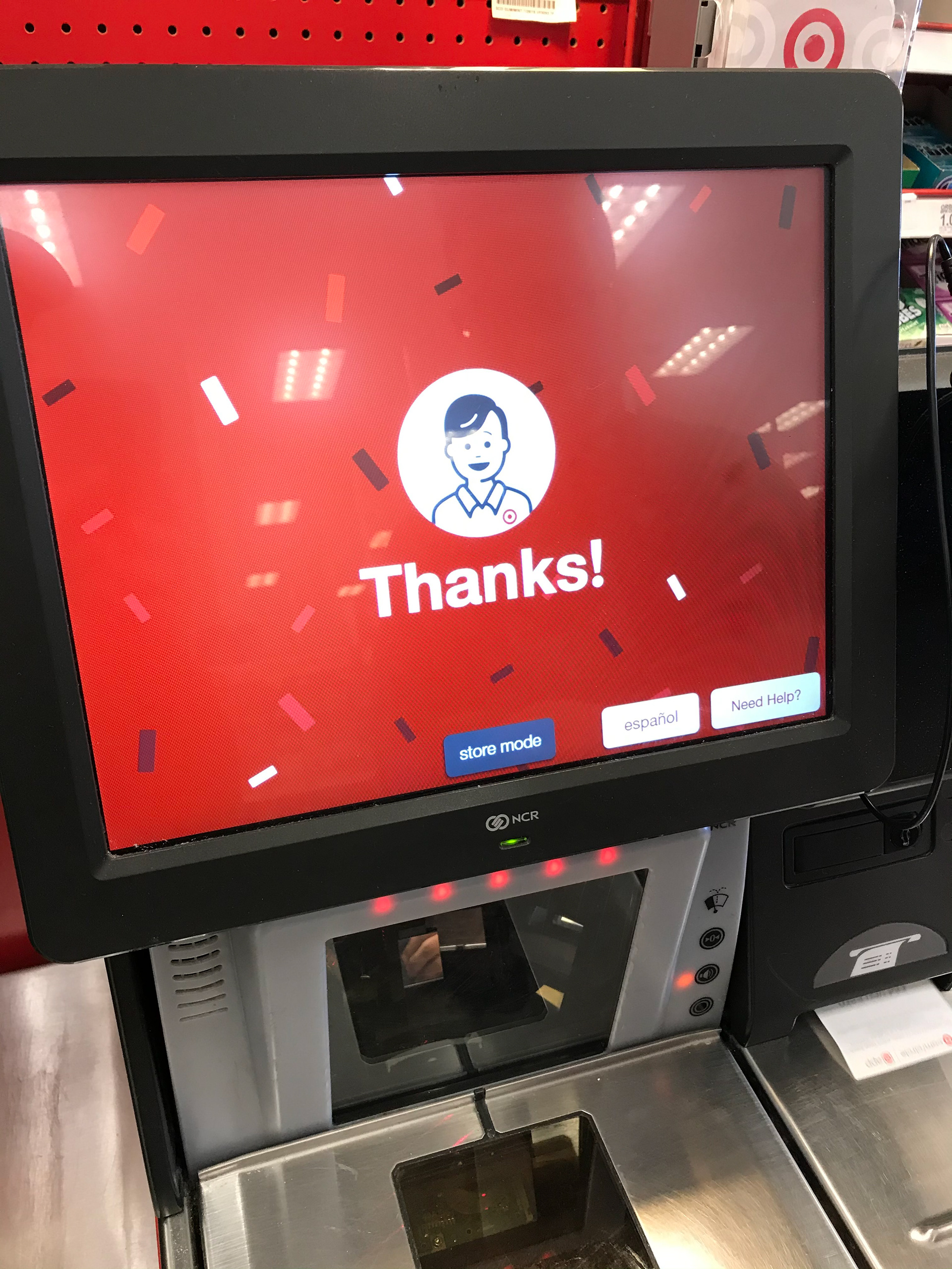
Observation #3
Summary
Overall, the user experience was straightforward with few steps giving it less room for error.
Sketching
Rough Ideas
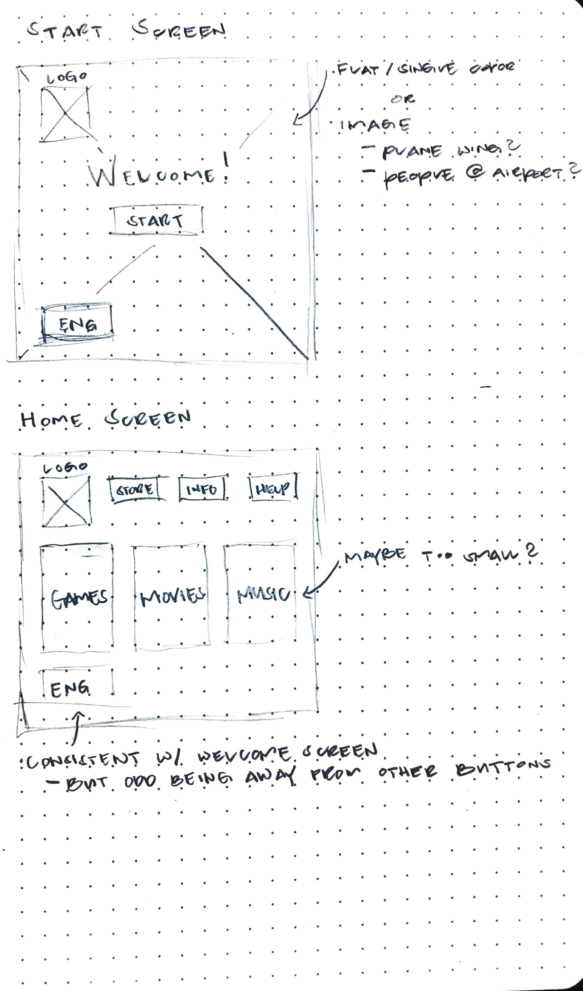
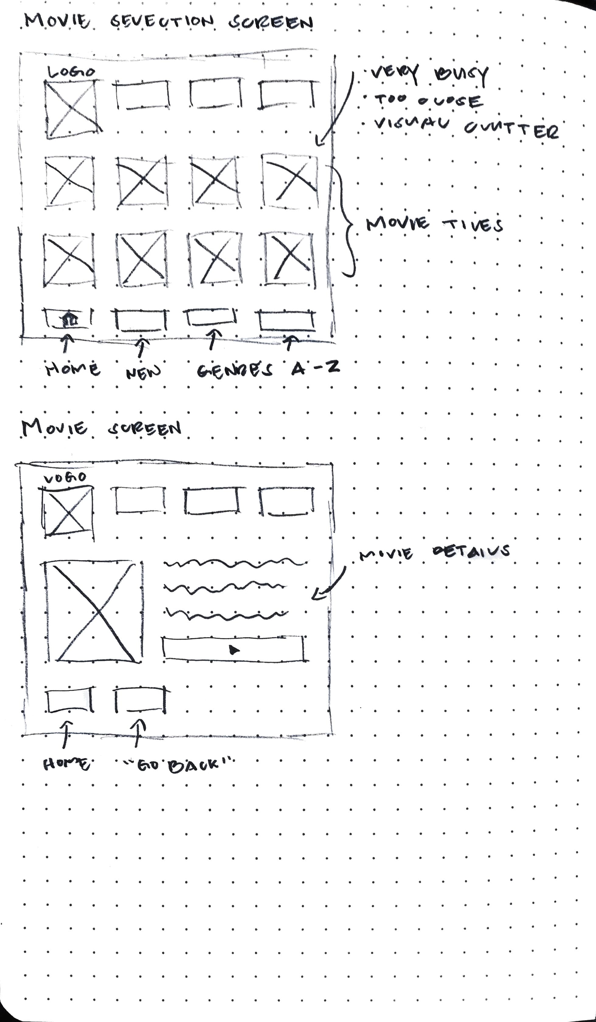
Using my research, I made low fidelity and scribble sketches to get a feel and rough idea of how I wanted to proceed.
Sketching
Low Fidelity Sketches
I didn't spend a whole lot of time sketching as the project only required so few screens and I wanted it to be very minimal. My objectives were clear and knew what I wanted quickly.
Digital Comps
Going to Digital
I took my sketches and made digital concepts enough to receive proper critique and feedback on.
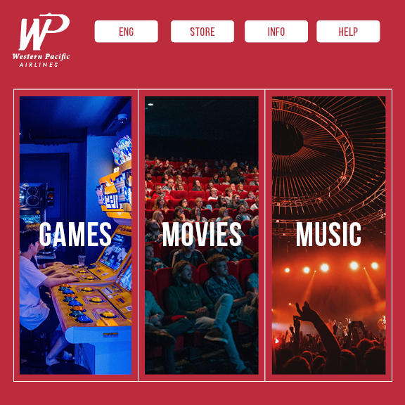
Design Reasoning
Utilizing My Research
For the first digital comp I kept in mind the two major observations I made from my research:
1. Minimal Design to not overcrowd the UI
2. Large buttons for readability and to make it large-finger friendly

User Tests
Was it Successful?
Five people participated in testing of the interface. I asked each of them to keep in mind the overall look of the kiosk and to take notes of what worked, what didn't, and what else I could include.
Revision #1
Ease of Access
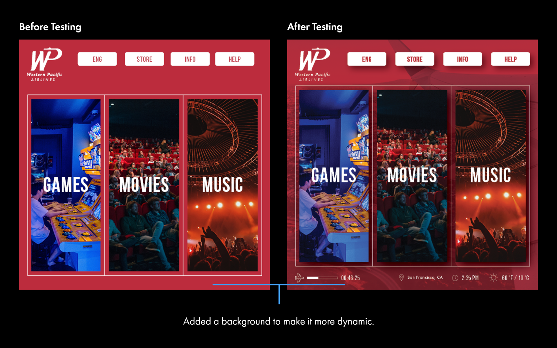
5/5 users reported back that on previous flights, useful information, such as approximately how much longer is left on their flight, would be displayed and would like for that to be added.
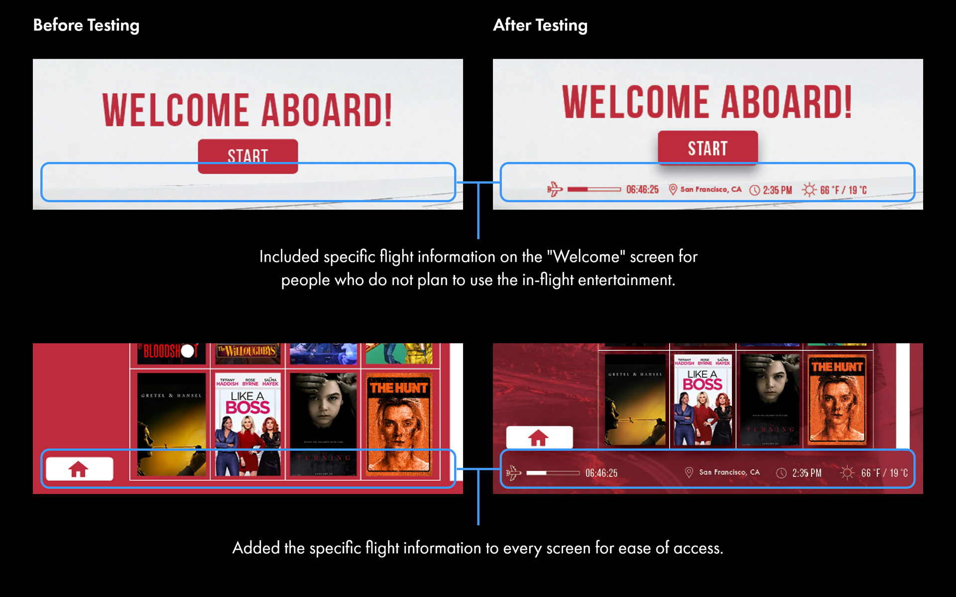
Revision #2
Dynamic Imagery
4/5 users reported back that while the design of the original iteration was fine, it felt lackluster with no personality.
Revision #3
Bolder Interface
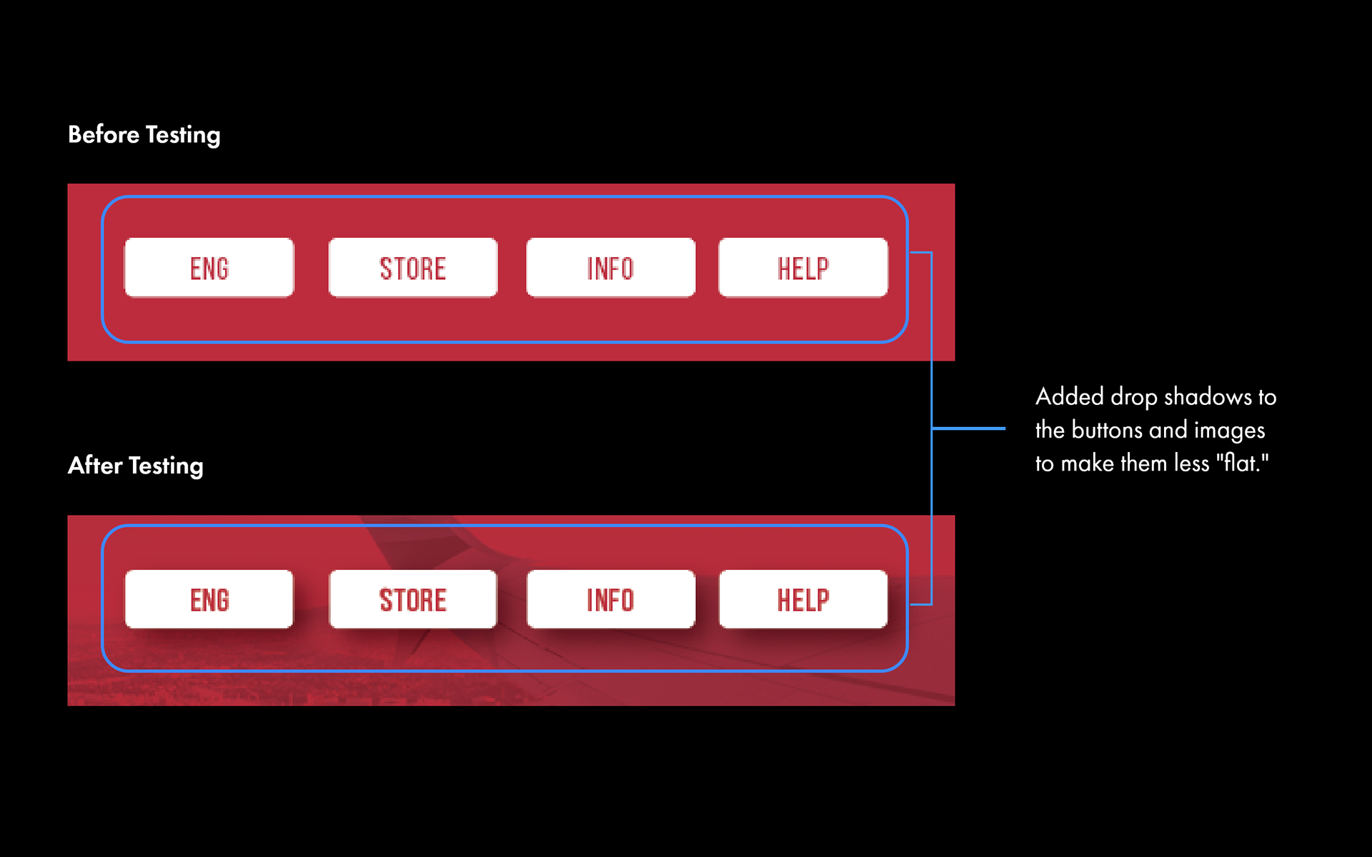
3/5 users reported back that the buttons did not stand out. In order to fix this they were given drop shadows for visual hierarchy and a cleaner aesthetic matching the current popular design trend of them.
Revision #4
Readability
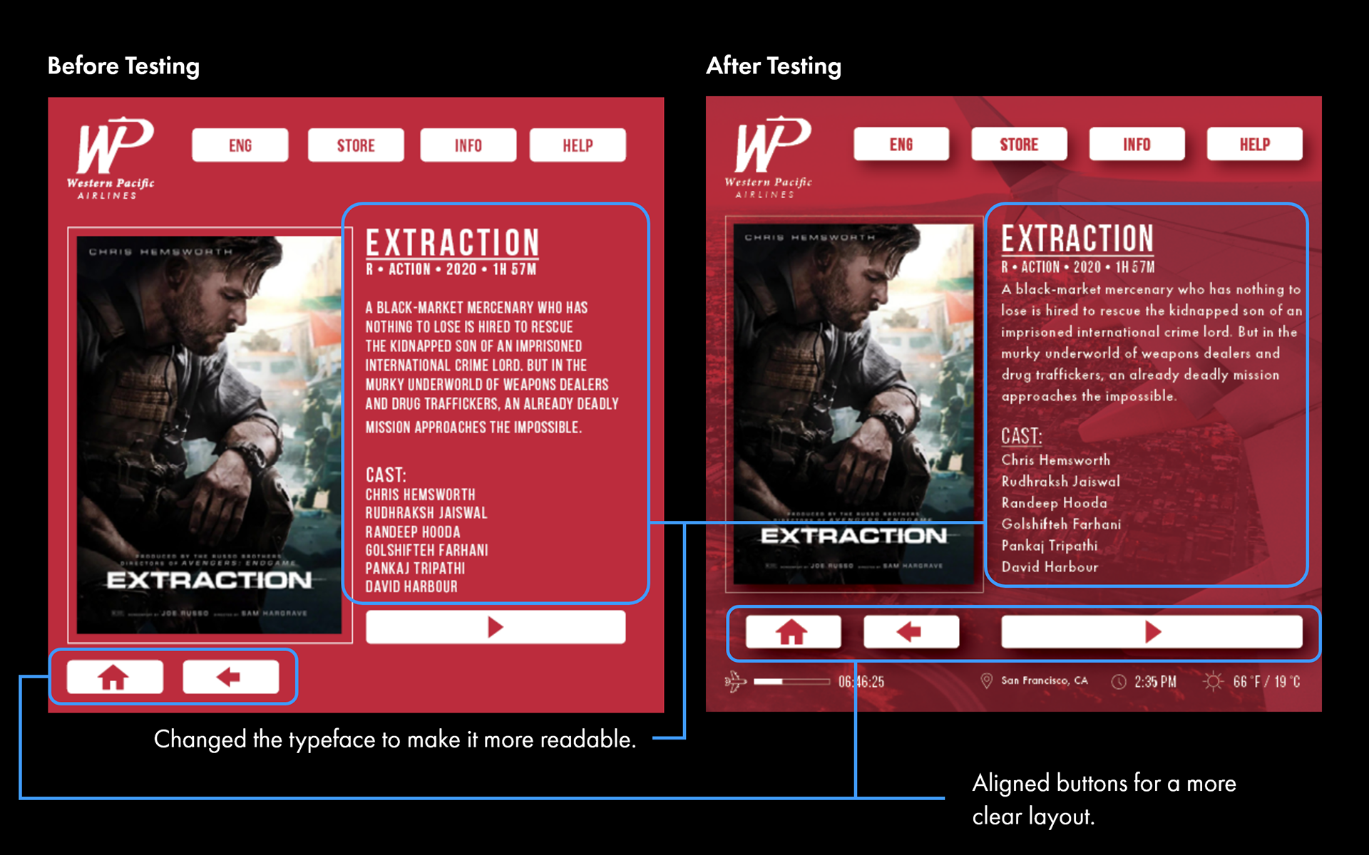
5/5 users reported that the text seen on the Movie screen was too hard to read. Small all-caps text is very hard to read, especially at smaller sizes, and was changed to a normal typeface to accommodate that.
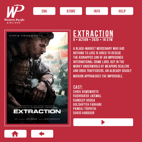
Final Design
Conclusion
Through the long process of researching, sketching, digitizing, and user testing I was very happy with the result! I was able to learn about the proper process and went through it smoothly and efficiently presenting the best project out of 30 people.